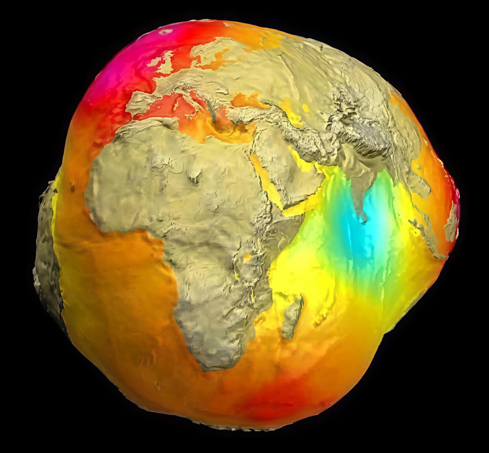
Did you know Earth isn’t a perfect sphere? What you’re looking at here is called the “Geoid” — a model of Earth’s true shape based on variations in gravity. Unlike the smooth globe we see in classrooms, the real Earth bulges, dips, and warps depending on the planet’s mass distribution beneath the surface.
The colors in this image represent gravitational highs and lows: Red/Orange = Stronger gravity (areas with more mass) Blue/Green = Weaker gravity (areas with less mass)
This distorted view helps scientists understand ocean circulation, sea level rise, tectonic activity, and even how the planet’s mass shifts over time.
It’s a reminder that Earth is far more complex than it appears from space .
What @yellowek is saying is more-or-less correct (although I wouldn't necessarily agree with the "Canadian shield" proposition as it is currently framed in mainstream academia). What it actually translates to is that we do not have a physics model that properly models gravity in relation to our earth and that the actual model of Earth itself is simply wrong. To me it is simply more supportive of the fact that gravity is a PUSH not a pull and that aetheric models and the hollow planets modeling both go much farther at explaining such anomalous data that we're seeing from these satellites.